Choosing the right color palette for your home is one of the most important steps in interior design. Colors influence mood, create ambiance, and define the personality of a space. Whether you’re redesigning a single room or your entire home, understanding how to select and combine colors can make a significant impact.
In this guide, we’ll explore practical steps to help you choose the perfect color palette for your home.
1. Understand the Psychology of Colors
Colors affect emotions and behavior, so it’s essential to choose hues that align with the atmosphere you want to create in each room.
Common Color Meanings:
- Blue – Calming and relaxing, perfect for bedrooms and bathrooms.
- Green – Refreshing and natural, great for living rooms and kitchens.
- Yellow – Energizing and cheerful, ideal for kitchens and entryways.
- Red – Bold and passionate, best used as an accent color.
- Neutral Tones (White, Beige, Gray) – Versatile and timeless, suitable for any space.
Before finalizing your palette, think about how you want to feel in each room.
2. Get Inspired by Your Favorite Elements
Look around for inspiration—nature, artwork, fashion, and even your favorite furniture pieces can guide your color choices.
Ways to Find Inspiration:
- Browse interior design magazines and Pinterest boards.
- Take note of the colors in your wardrobe (people often decorate with colors they wear).
- Find a piece of artwork, a rug, or furniture that you love and build a palette around it.
3. Choose a Base Color
Start with one primary color that will set the foundation of your home’s palette. This should be a color you truly love and can see yourself living with long-term.
How to Choose a Base Color:
- Select a neutral if you prefer a timeless, flexible look.
- Choose a soft pastel for a light and airy feel.
- Pick a rich, deep color for a cozy, dramatic effect.
Once you have a base color, you can build the rest of your palette around it.
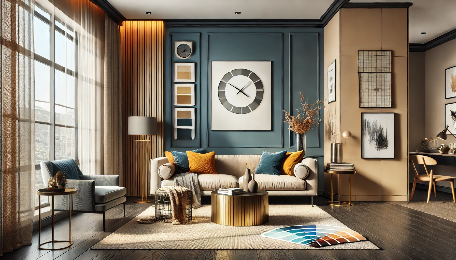
4. Use the 60-30-10 Rule
A well-balanced color scheme follows the 60-30-10 rule, which helps distribute colors in a visually appealing way.
- 60% – Dominant color (walls, large furniture, rugs)
- 30% – Secondary color (curtains, accent walls, smaller furniture)
- 10% – Accent color (decor pieces, pillows, artwork)
For example, if your dominant color is beige, your secondary color could be navy blue, and your accent color might be mustard yellow.
5. Consider Lighting Conditions
Lighting dramatically affects how colors appear in a room. The same paint color can look different in natural daylight, warm artificial light, or cool LED lighting.
Tips for Testing Colors in Different Lights:
- Paint small swatches on different walls and observe them at different times of the day.
- Use fabric samples and decor items in different lighting conditions before committing.
- Choose lighter shades for dimly lit spaces and bolder hues for rooms with plenty of natural light.
6. Stick to a Consistent Theme
A cohesive theme helps ensure your home feels well-designed and harmonious. Consider the overall style of your home before selecting colors.
Popular Color Schemes by Style:
- Modern: Neutral tones with pops of black, white, or metallics.
- Bohemian: Earthy tones like terracotta, olive green, and mustard.
- Coastal: Light blues, sandy beige, and crisp whites.
- Industrial: Darker shades like charcoal, deep brown, and concrete gray.
Choosing a theme makes it easier to select colors that complement your furniture and decor.
7. Use Online Tools for Color Matching
If you’re unsure about which colors work well together, several online tools can help generate color schemes.
Useful Color Palette Tools:
- Adobe Color – Helps create harmonious color combinations.
- Coolors – Generates custom color palettes.
- Sherwin-Williams ColorSnap – Allows you to visualize colors in a room.
These tools can provide professional-level guidance and prevent mismatched colors.
8. Test Before You Commit
Once you’ve chosen a palette, test it before painting an entire room or purchasing decor.
How to Test Your Colors:
- Buy sample-sized paints and apply them to a small section of the wall.
- Experiment with removable wallpaper if you’re unsure about bold colors.
- Incorporate color through textiles like curtains and cushions before making permanent changes.
9. Create Flow Between Rooms
If your home has an open floor plan or multiple connected spaces, the colors should flow smoothly from one room to another.
How to Achieve Color Flow:
- Use variations of the same hue (e.g., light blue in the living room, deep blue in the bedroom).
- Keep neutrals as a unifying base and add different accent colors.
- Use similar undertones (warm or cool) across all rooms.
10. Don’t Be Afraid to Break the Rules
While these guidelines are helpful, your home should reflect your personality. If you love bold colors or unconventional combinations, go for it! Interior design is about self-expression, and the best spaces are the ones that make you feel happy and comfortable.
Final Thoughts
Choosing the perfect color palette for your home is both an art and a science. By understanding color psychology, testing shades in different lighting, and following fundamental design principles, you can create a space that feels cohesive, stylish, and uniquely yours.